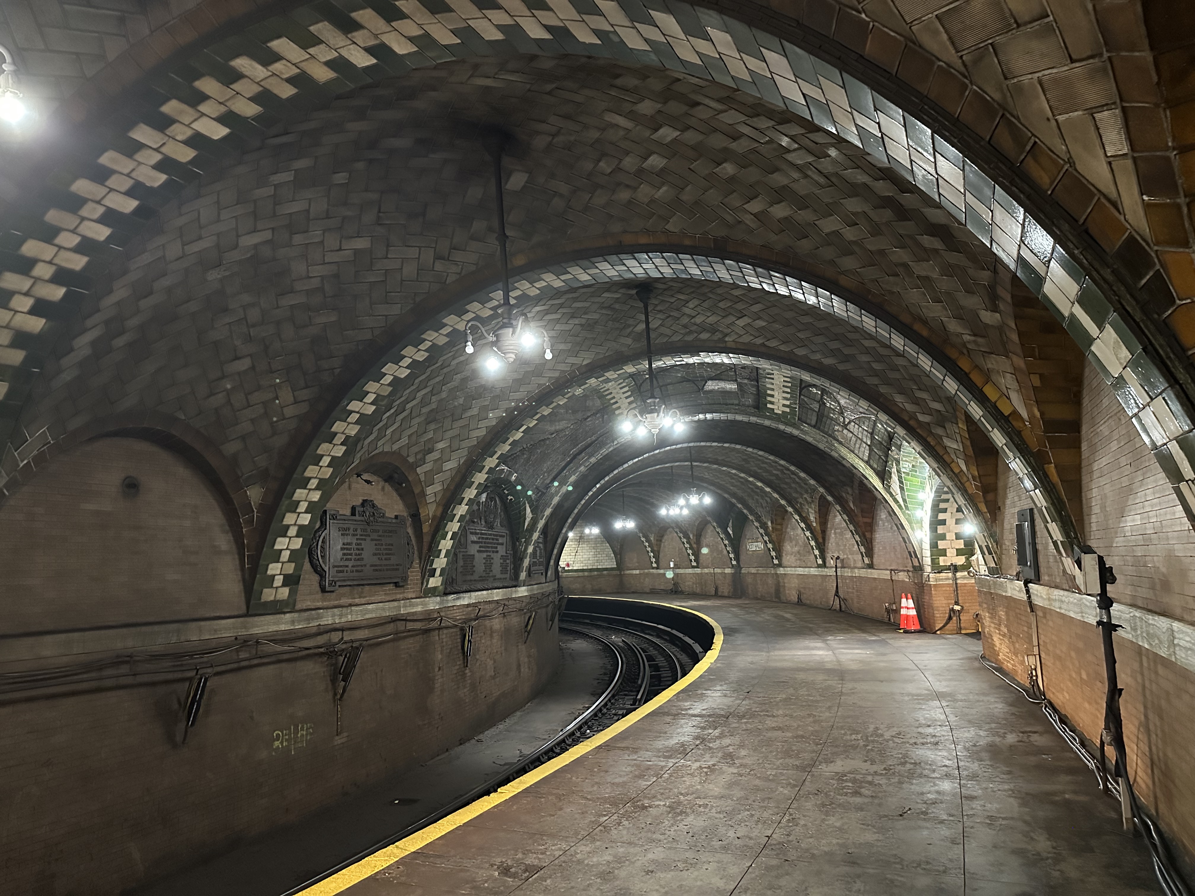
New York has an extensive subway system with 472 stations connected with 28 lines, it is the biggest subway system in the world.
Going back in time, the first subway in New York left from City Hall station in 1904 to much public attention.
Time has moved on and the subway system outgrew the station in a literal sense, trains became too long for the station and it was abandoned.
The station is currently not accessible outside of guided tours.
Even before moving to the US I heard about old City Hall station in New York and wanted to visit it.
When I moved to New York I started eyeing tickets but due to COVID tours were suspended.
This weekend however we managed to attend one of the first tours since suspension and it was great.
A note on light: although this is the subway, there are skylights.
These will impact what your photos will look like, when we went to visit it was cloudy, i.e. cameras that can’t deal well with dark environments will have a hard time.
How to book
These tours are organized by the fantastic NY Transit Museum, for more details on the tours see here.
More details on the station are available on Wikipedia.
This tour was great, if you are able to I would suggest you go!
Measuring COVID-19 in the air is not currently possible, but CO2 concentration can be used as a proxy for consumed air. On a recent flight I found that CO2 levels were highest during boarding when ventilation was off, became better after takeoff yet remained at an elevated level throughout the entire flight. While HEPA filters help mitigate the risk of highly consumed air, we are dependent on airlines to apply high quality filters when cycling air or individual masking to keep passengers healthy. Based on these findings it seems important to at least wear a mask from boarding until reaching cruising altitude during air travel.
Note: I am a software nerd - none of this is medical advice, it is merely an artifact of my curiosity.
Introduction
As we are a few years into the pandemic, we have learned much about the risks and prevention of COVID-19. Due to general availability of effective vaccines and high filtration masks and the knowledge that outdoor air is less susceptible to transmission, we are in a far better position than two years ago. However, understanding the risk of indoor settings is something many (including me) still struggle with.
I was interested in learning more about the air flow and circulation to help me gauge risk levels of respiratory disease transmission. Or more generally - under what circumstances is an indoor setting as safe as outdoor? Not all indoor settings are equal, some require masking to be safe while others might not. There is no good way to measure COVID-19 in the air today but we can measure carbon dioxide (CO2) levels. Since humans breathe out carbon dioxide, CO2 levels in the air is an established indicator for the level of ventilation quality. If CO2 levels are low, then the air is less consumed and if CO2 levels are high, then the air is more consumed and can be a risk. While high CO2 levels in an indoor environment does not necessarily mean higher risk for COVID-19, it introduces a dependency on air filtration to be safe.
With this in mind, we can use CO2 levels as a proxy for risk for COVID-19. The measure is an indicator of potential risk with the caveat that high CO2 environments can be mitigated through air filtration e.g.: HEPA.
CO2 Measurements
CO2 is measured in parts per million (ppm), which represents the number of CO2 molecules per million molecules of air. To provide reference points for my measurements: Outdoor settings or areas with high airflow are expected to be at around 400 ppm. Indoor settings with 800+ ppm can be considered as suboptimal for ventilation and 1500+ ppm in an occupied room is an indicator for poor ventilation.
Flight CO2 Measurement Methodology
Air travel means sitting close to strangers in a tight, enclosed space. Flights use complicated ventilation systems and are considered to provide high quality air. I wanted to understand CO2 concentration during a flight, and decided to measure during boarding, while flying, and at landing.
For this experiment I used a Vitalight Mini CO2 Detector. The device requires outdoor calibration which will anchor 400 ppm, this is also the lowest measurement the device can perform.
I recorded with up to one minute granularity, average of two minutes, maximum gap was 14 minutes. Overall, I believe this granularity to be fine enough to give a good sense of CO2 concentration. While face-level is generally recommended for air measurements, I decided on measuring at waist-level since it seemed more comfortable when measuring for 3 hours. I spot-checked that waist measurements were similar to face-level. I sat in row 10 of an Embraer E170 plane and boarded early.
Findings
Plot Description: The blue line represents CO2 measurements sampled with my Vitalight Mini CO2 Detector during a 3 hour flight. The green dotted line represents outdoor CO2 levels (400 ppm). The yellow dotted line represents suboptimal CO2 levels (800 ppm) and the red dotted line represents poor CO2 levels (1500 ppm). Flights can be broken up into a series of events: start of boarding, doors closed, takeoff, reaching cruising altitude, landing. We’ve highlighted these events with vertical lines and CO2 ppm at that time. Direct link to plot: svg - png
The CO2 levels are high throughout the entire flight. When boarding the plane the levels were at 1138 ppm, but as more people entered the plane the levels were rising. Boarding completed at 1546 ppm, at takeoff the levels were at 1649 ppm and started to drop and stabilized between 1100-1200 ppm. Based on noise observation, it appears the ventilation of the plane was off during boarding. We can see in the plot that CO2 levels start to drop after takeoff.
But what about air filtration?
There are three sources of air when traveling on a plane: Fresh air from the outside, consumed air from seating neighbors, and previously consumed air that went through a HEPA filter. These filters are common, most planes use them to remove pollutants from the air when circulating consumed air from the cabin. These filters are not available on small or older planes, and have obvious limitations: “HEPA filters can only clean the air that circulates through them, so if a passenger sneezes and there is no filter between, the filter cannot clean that air” - Boeing.
It is important to keep in mind that HEPA filters will not remove CO2, so our measurement cannot distinguish filtered from unfiltered air and considers CO2 regardless of filtration status. Measuring the ratio of that blend is not something we have the tools to assess. COVID-19 pollutants should have been removed if they pass through a filter but will still be considered as consumed by the CO2 meter. As a result, a cabin measurement of 1100 ppm is potentially better than 1100 ppm in an apartment with no air filtration, but we cannot tell independently by how much. FAA provides information on standards they set for cabin air quality. Overall, air in cabins is better than the CO2 measurement would suggest. However, we depend on airlines to maintain the filters regularly.
Takeaway
Based on the CO2 levels observed during the flight, we see that the levels are in suboptimal to poor range for ventilation. The CO2 levels are especially high during the boarding process until reaching cruising altitude. As flight passengers, we are dependent on air filtration quality on planes to create a safe environment.
Based on noise observation, the ventilation was off during the boarding process and only enabled after boarding was completed and before takeoff. As a result, I suspect the air is not filtered during this time. This would mean that not only is CO2 high, but also that there are no mitigations in place to prevent spread of COVID-19. It appears that boarding presents the highest risk for respiratory infection during the observed flight.
During the rest of the flight the CO2 levels were still elevated. These levels are less concerning compared to the boarding process for two reasons. First, CO2 levels themselves are lower meaning the air is less consumed. Second, since during the flight the ventilation is operating, it creates an opportunity to filter contaminants out.
As a passenger, it seems important to wear a mask at least during the boarding process especially if the air filtration system is off. After boarding, there is potentially lower risk since the air filtration is turned on but with limited information on the quality of the air filtration in specific planes and for specific flights, we can only conclude that it is lower risk than boarding but still hinges on good filtration.
Overall, the goal should be to make indoors as safe as outdoors. We are dependent on airlines to provide adequate air filtration systems to keep us safe throughout the entire flight. I hope that airlines take this responsibility seriously for the health and safety of their passengers.
Should you buy a CO2 monitor?
Maybe! I like the monitor because it gives me insights on air quality that are not otherwise perceptible to me. I have been positively surprised in some instances. The NYC subway often has readings around 500 ppm, which is close to outdoors. Elevators in some modern buildings also provide essentially outdoor air quality.
Limitations
I want to address the limitations of this study. Most importantly, this study represents a single flight. The plane was older and might not be representative of the entire fleet. While the results are in line with related work, more measurements across a wide variety of planes and airlines would help to paint a full picture. Furthermore, keeping ventilation off during boarding is not a consistent process from my observations.
Related work
Using CO2 as measure for indoor air quality is an established practice. Also, see this study that discusses office settings and summarizes efforts in the research field. This article provides more information on HEPA filters, FAA regulations are available here.
I am not the first to measure CO2 on a plane. Previous research has found that CO2 levels were elevated during the flight but highest during boarding, which is in line with my findings. The authors measured multiple flights but also the way from/to the airport and hotel settings.
Conclusion
I measured the CO2 concentration on a 3 hour flight as a proxy for COVID-19 transmission. I found that the concentration of CO2 was the highest during boarding and only started to drop after takeoff. Throughout the entire flight CO2 was elevated compared to an outdoor setting. From my point of view wearing a mask on flights seems justified, at least during the boarding process and especially if ventilation of the plane is off. These risks can be mitigated through high yield filtration systems in planes, if regularly maintained by airlines.
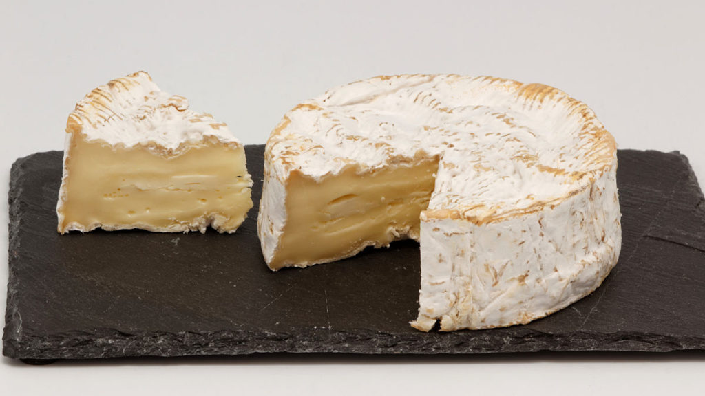
The pie chart is a very successful way of displaying proportions. However, it was never properly named by it's inventor William Playwright.
It has different names in different languages, but apparently often based on food. Pie in English, Cake in German, Pizza in Portuguese, and Camembert in Frech. This sparked my interest what else is out there. To solve this, I made a short Google Cloud program to translate "pie chart" to 103 different languages and back. I found that there are more odd cases than Camembert, such as "cookies" in Hmong, "skin" in Samoan, or "chart chart" Kazakh. These results are established via Google Cloud Translate only and not verified by native speakers.
Depiction of a Camembert. Or a pie. What's the difference really? File from Wikipedia: https://en.wikipedia.org/wiki/Camembert
Introduction
Pie charts are roughly 200 years old and are a very popular form of displaying proportions. Also, pie charts were not properly named when they were introduced.
Many of the names used for this chart around the world are based on food. For example, in German "pie chart" translates to "Tortendiagramm" which literally translated would be a "cake diagram". What prompted this investigation was this tweet. This post digs a bit into this phenomenon but I was curious whether I can go further. I thought there must be more to pie charts around the world.
Translations
As the year is 2019, all such investigations must involve the cloud. Therefore I used the Google Cloud Translate API to explore the depths of pie charts in 103 different languages.
In a first step I checked how the German and French case translate back to English. Theoretically, a flawless translation would go from "pie chart" to ? to "pie chart". This is called round-trip translation and considered a controversial quality metric for automated translation.
However, a literal translation would lose the original meaning and possibly expose different meanings. This is through limit of context - the translation engine makes a best effort picking out of multiple possibilities. While "camembert" translates back as "camembert", by adding more context translating "draw me a pie chart" translates to French as "me dessiner un camembert" and back identically. However, these literal translations due to lack of context are great for the purpose of this project.
To verify this briefly I translated the word to French and German - and back. Google Cloud Translation results in "Cake chart" and "Camembert". (The code for this is in the repository, function "de_fr_only".) As this worked out I went on to translate "pie chart" from English to 103 available languages, and back. The code is available here.
A note on limitations: I only receive one result per translation, languages could have several expressions for pie charts, I will only see one. Furthermore, the translations might simply be imperfect.
Results
Google cloud translation API supports 103 languages other than English. I wrote this program to translate "pie chart" to all of these languages and back.
The results are in the file all_the_pies.json, which is a JSON dictionary with two keys: "pie_to_foreign", and "foreign_to_pie". Each element contains a list "from" and "to", with the language indicator and the expression. This data structure is more verbose than required, a dictionary indexed by two-letter language code would have been sufficient for each. I did it this way as I wasn't sure what I want to do with the data later, and 103 languages are not all that much in the grand scheme of things.
When looking at the data, I noticed 74/103 of these are pie based, however, only 67 are "pie chart". Greek doubles the effort with "pie pie", Bengali has a "pie image", Portuguese is hedging bets with "pizza pie". Furthermore, "board pie": Haitian Creole, "graphic pie": Corsican, but most on-point is Afrikaans: "pie". 4/103 are cake based, however: 2x "diagram", 1x "chart" and 1x "table". I guess we could say that the pie chart takes the cake!
Other than cakes and pies or previously discussed examples, these 24 are different than the others.
card - Estonian
cart shape - Yoruba
chart chart - Kazakh
circular chart - Vietnamese
circular diagram - Bulgarian, Persian, Slovenian
circular graph - Croatian, Galician
diagram - Basque
drawing - Hausa
glassy table - Tajik
Graph of proportions - Romanian
Hidden chart - Pashto
organizer - Igbo
papa map - Maori
pastry photo - Azerbaijani
Pirate Chat - Sinhala
Point plan - Luxembourgish
skin - Samoan
table - Somali
table of the patient - Swahili
tablet - Hawaiian
the cookies - Hmong
Notably only "pastry photo" and "the cookies" are food based, all others are not related to food. I.e. 22/104 languages supported in Google Translate use an analogy not related to food for their expression of pie charts. While running this set me back 12 cents in cloud compute cost, I would argue that this insight was worth every penny!
Closing Thoughts
The majority of languages seems to relate pie charts to food, and within that mostly to pies. There are several notable exceptions that might seem obscure to English speakers. However, it remains an open question whether providing a proper name by Playwright for his creation 200 years ago would have lead to a less diverse naming situation for this chart. Maybe a good takeaway is to name inventions and systems straight away, as opposed to letting others name them.
As some might notice, this post lacks any actual pie charts. If you have been reading until here to see a pie chart, you have been tricked!


